An intuitive iOS app for complete motherhood care through structured naturopathy guidance, trusted content, remedies, and community support.
UI & UX - App Design
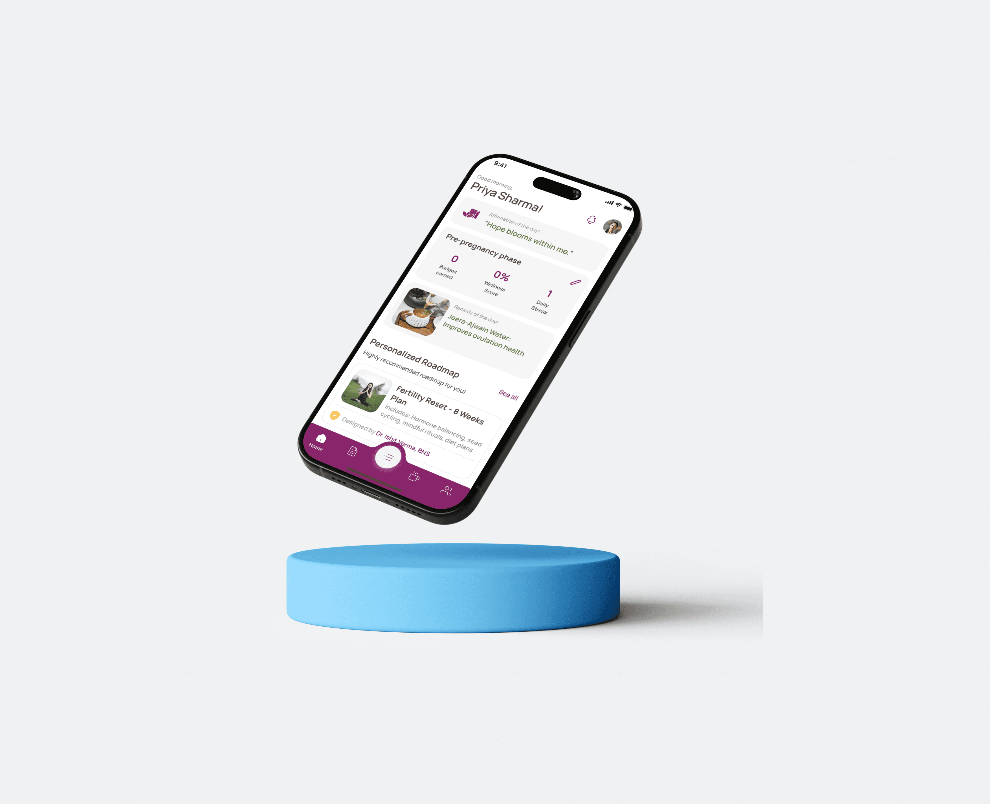
Designing a native iOS experience for MaayaPath focused on emotional wellness, aligned with Apple Human Interface Guidelines and mobile-first interaction patterns.
Project Overview
Product Type: Women Wellness App
My Role: End-to-end product design
Duration: 18 Months
Tool Stack: Figma, FigJam, Google Doc, Zaplin, Jitter, Notion & Canva
Platform: iOS (Native-first approach)
Focus: Accessibility, calm UX, emotional engagement
About the App
Maayapath is a nurturing iOS wellness app that supports women through fertility, pregnancy, and postpartum with personalized roadmaps and natural remedies.
Rooted in naturopathy, it blends calm design with intuitive UX to offer a safe, empowering space for holistic healing.
Problem: Users overwhelmed during emotional phases
Solution: Structured, calming guided flows
Impact: Improved engagement and usability
iOS Design Thinking & Decisions
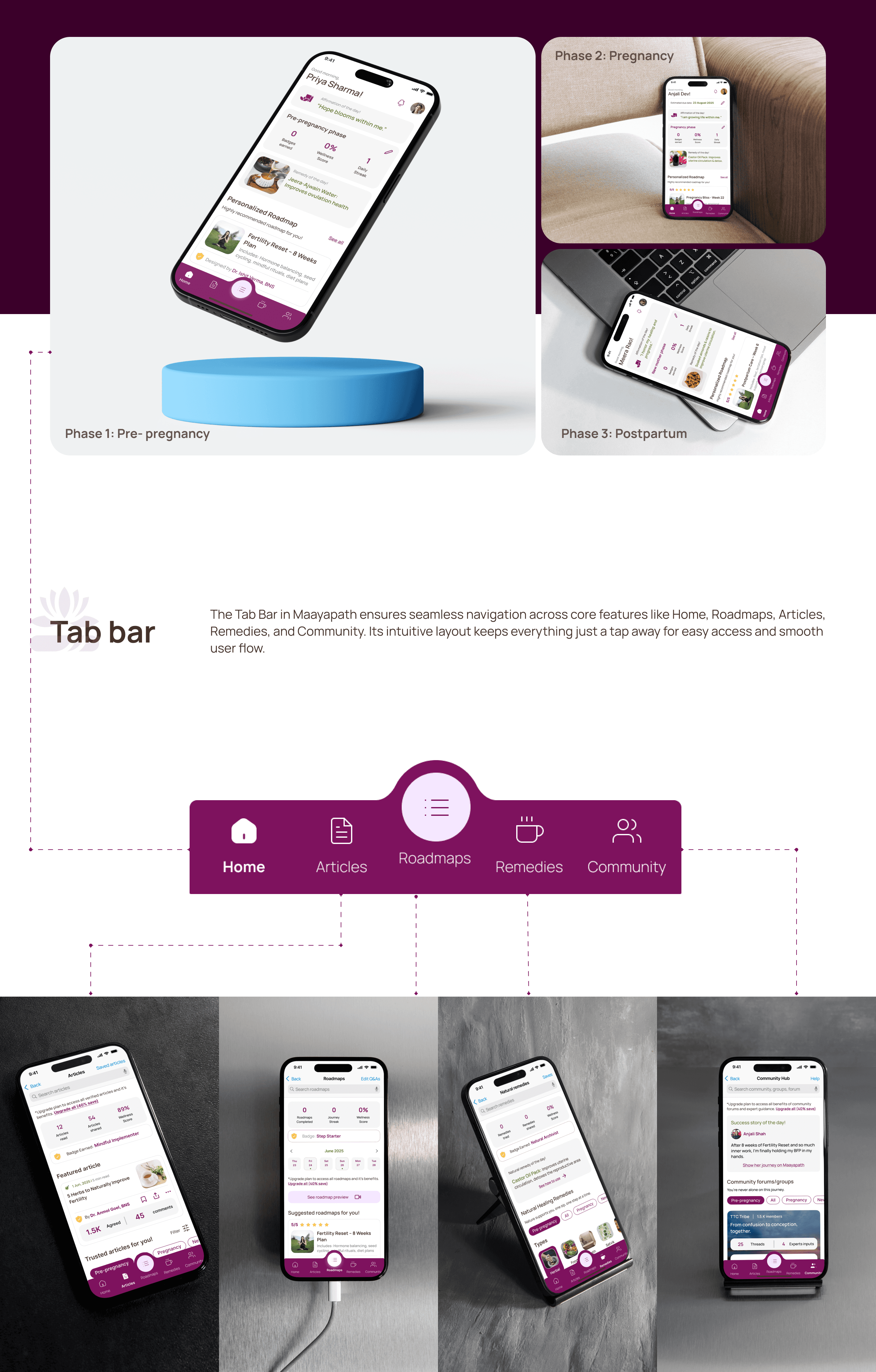
Used tab bar navigation for primary sections (Home, Community, Remedies)
Maintained hierarchical navigation (push pattern) for deeper journeys
Followed iOS spacing, typography, and touch targets
Designed interactions aligned with native gestures and scroll behavior
Alignment with Apple HIG
Clarity → minimal UI, readable typography
Deference → content-first design (calm visuals)
Depth → layered cards, subtle shadows
iOS Design System
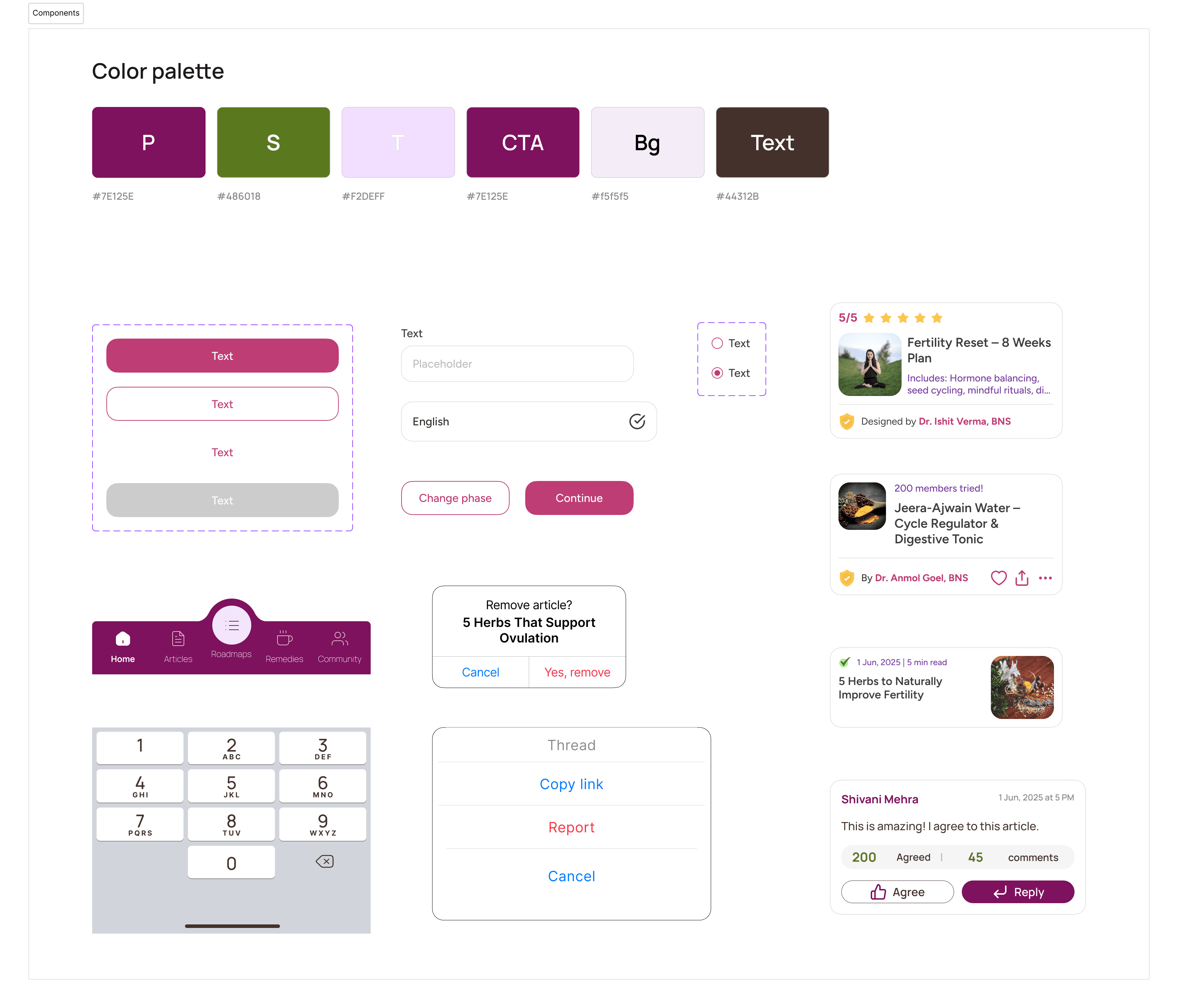
Defined reusable components (cards, buttons, inputs)
Built consistent spacing and typography scale
Created scalable patterns for future features
Ensured consistency across all screens
Dark Mode Considerations
Designed color tokens adaptable for light & dark themes
Maintained contrast and readability
Avoided pure black/white for better visual comfort
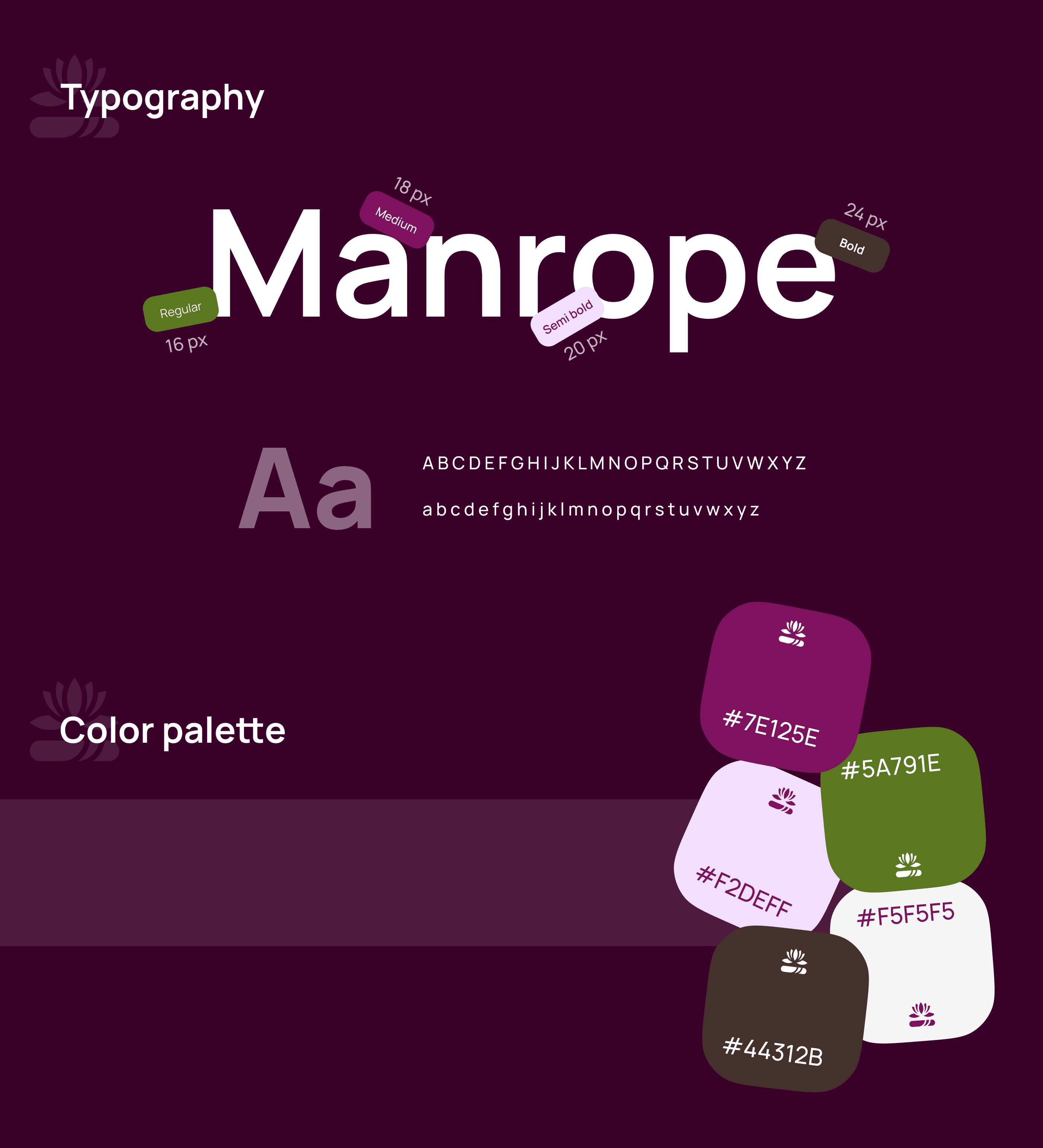
Typography & Color Palette
Manrope was chosen for its modern, clean, and legible design that perfectly reflects Maayapath’s calm, nurturing, and trustworthy tone. Maayapath’s iOS color palette follows the 60-30-10 rule, blending deep plum, olive green, and soft neutrals to create a calming, earthy, and emotionally safe experience.
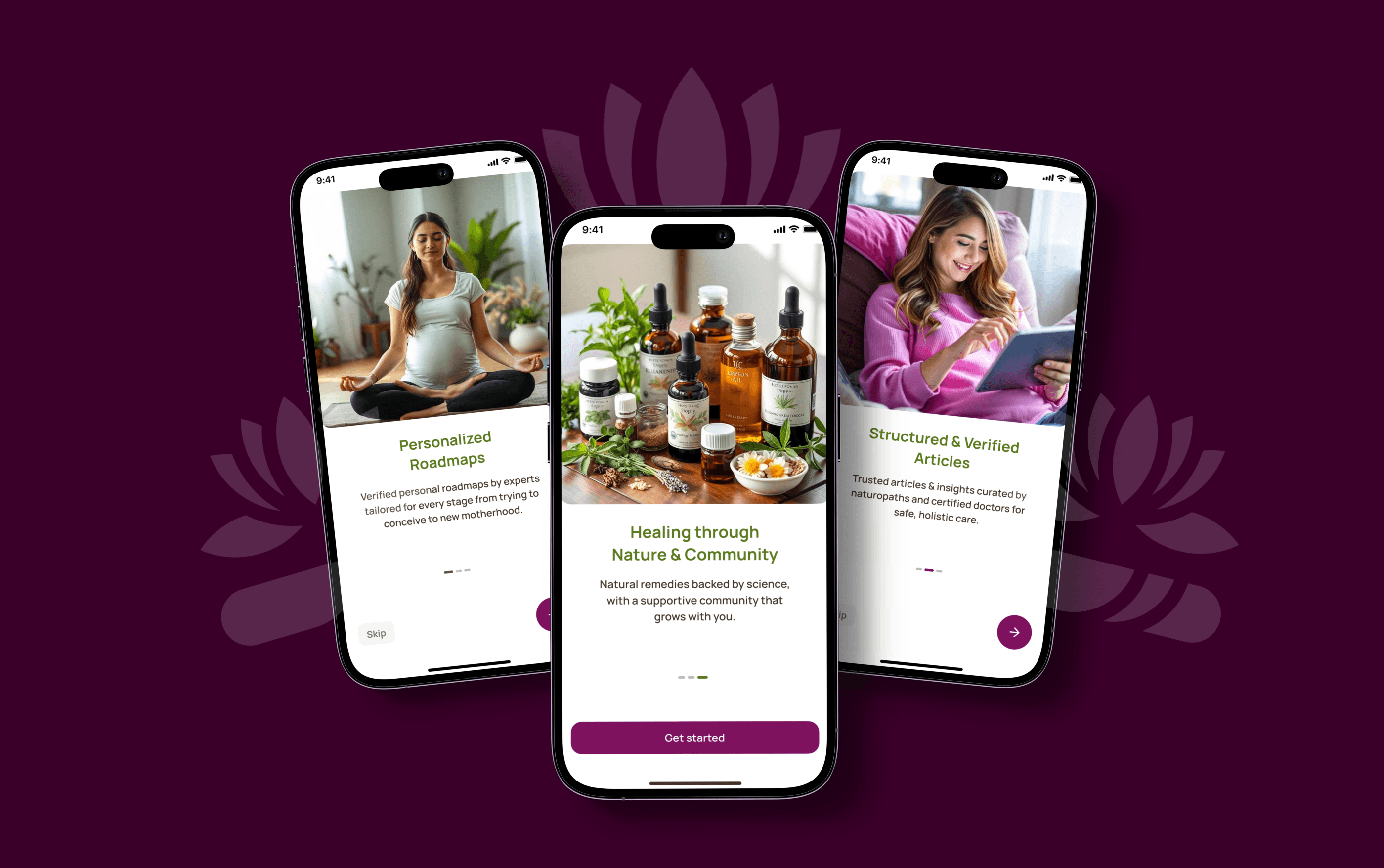
Walkthrough Screens
Maayapath’s walkthrough screens gently introduce core features with calming visuals and clear messaging, setting the tone for a serene onboarding experience.
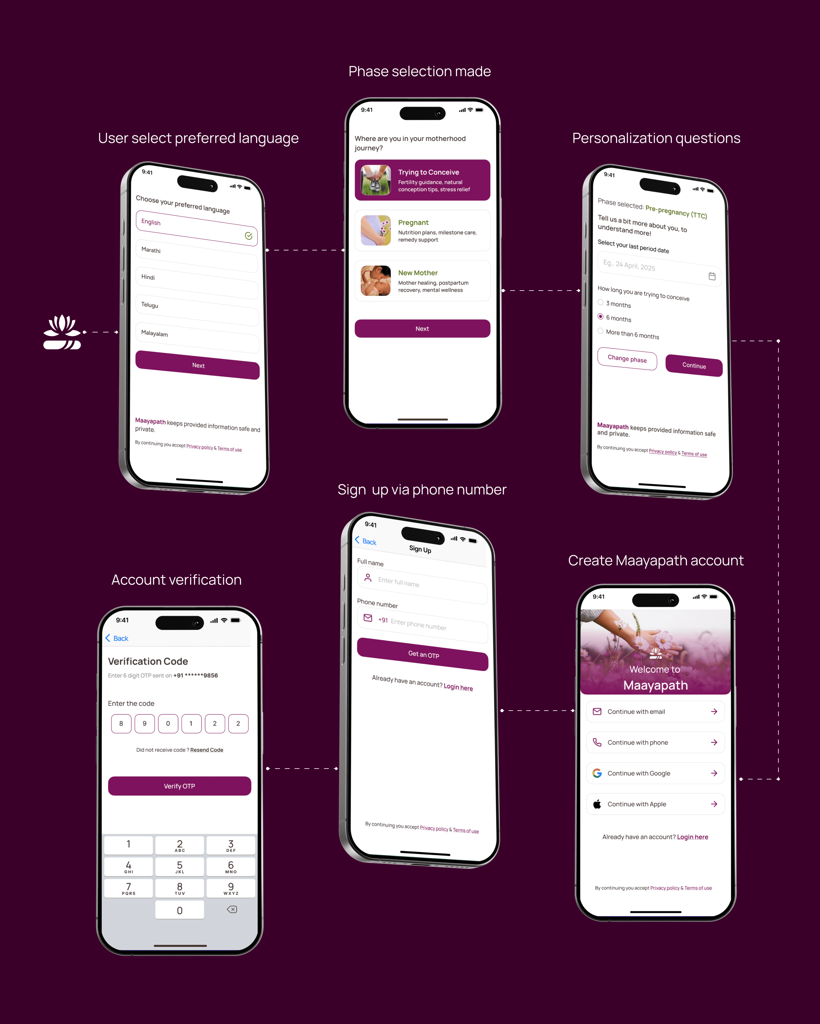
Onboarding Screens
Maayapath’s onboarding flow is empathetic and phase-personalized, guiding users with soothing UI and emotionally mindful interactions.
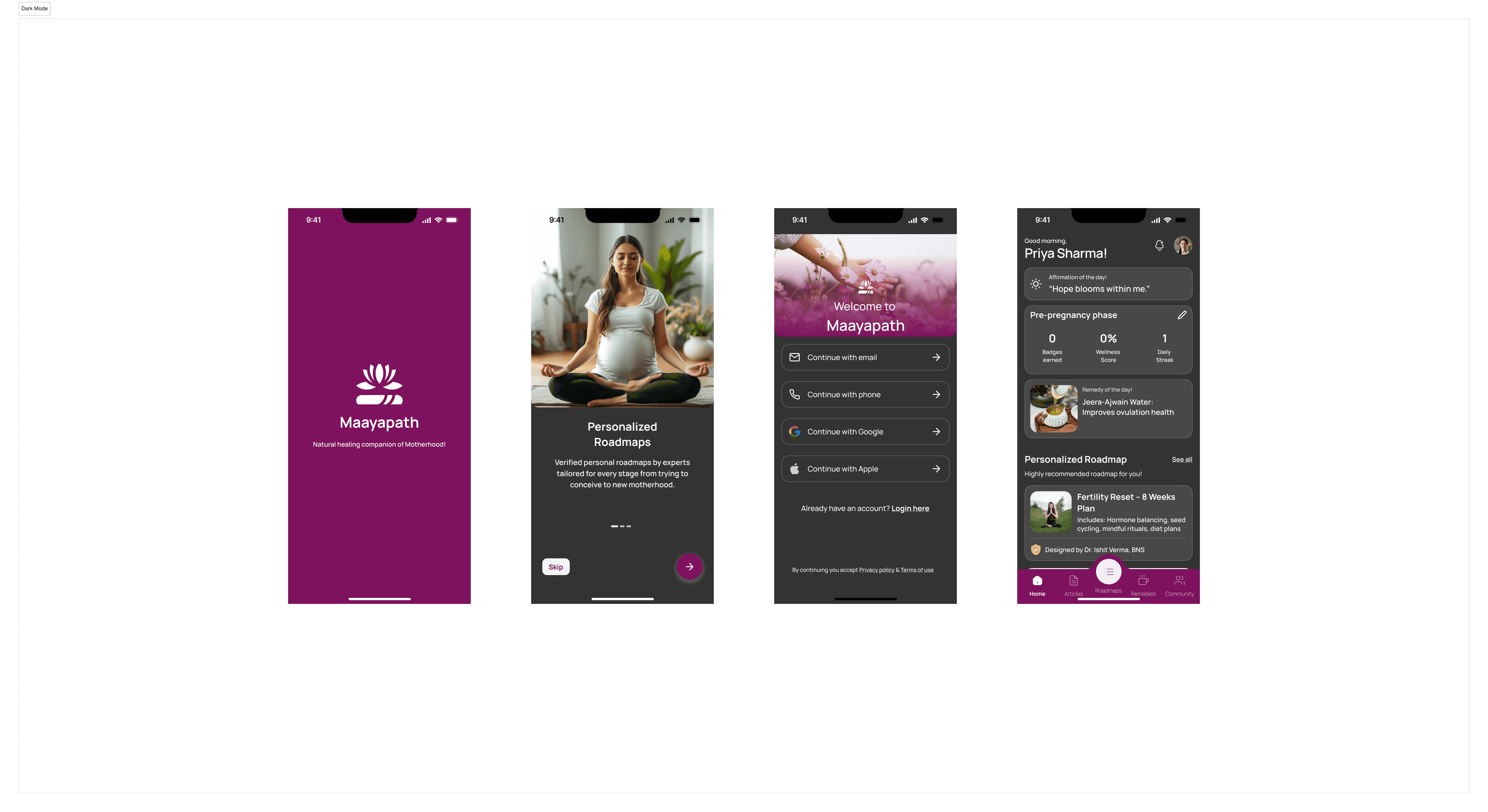
Maayapath’s Home Screen
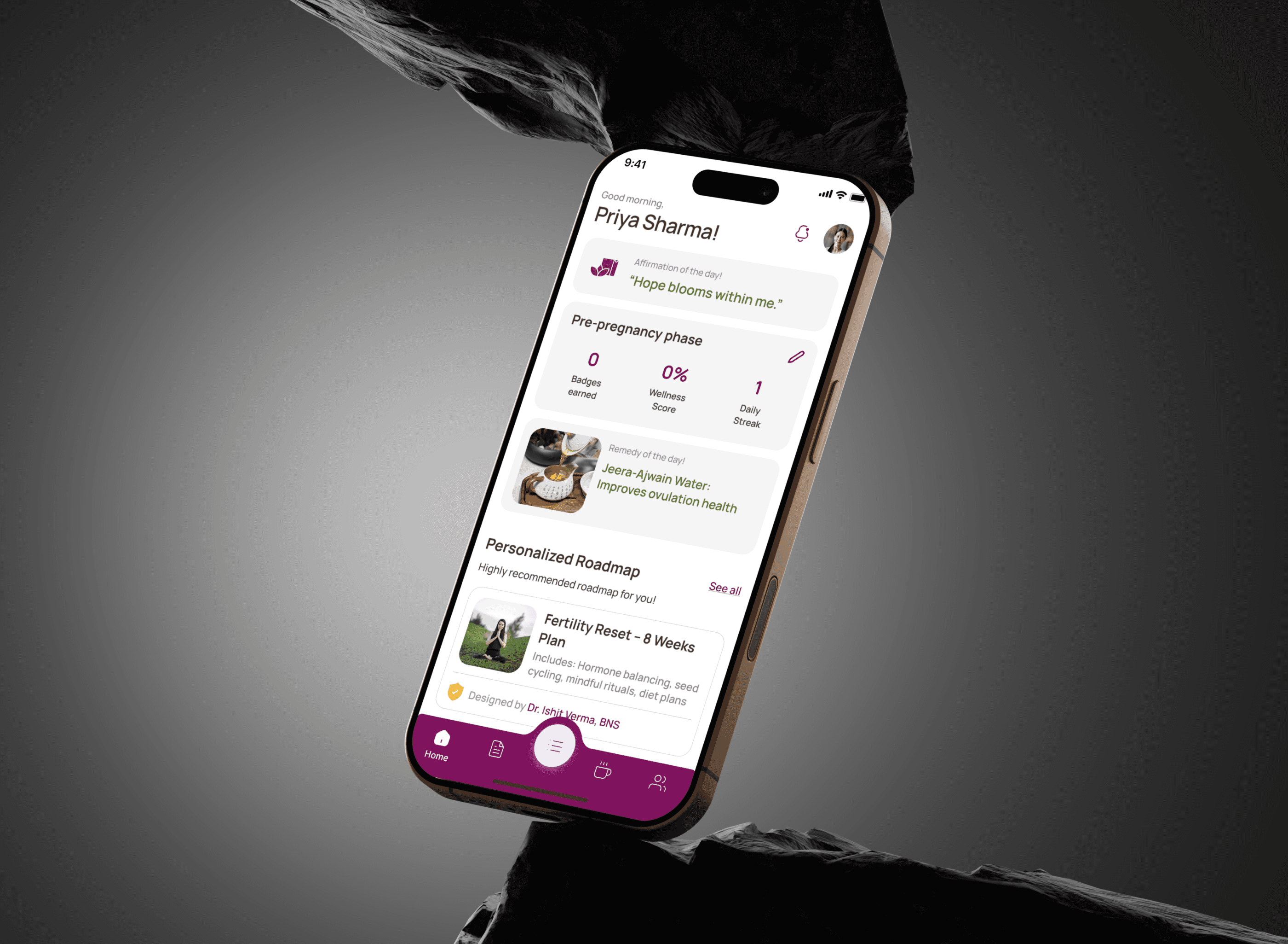
The home screen offers a calm, personalized dashboard with easy access to all four phases Fertility, Pregnancy and Postpartum supporting users wherever they are in their journey.
App Flows
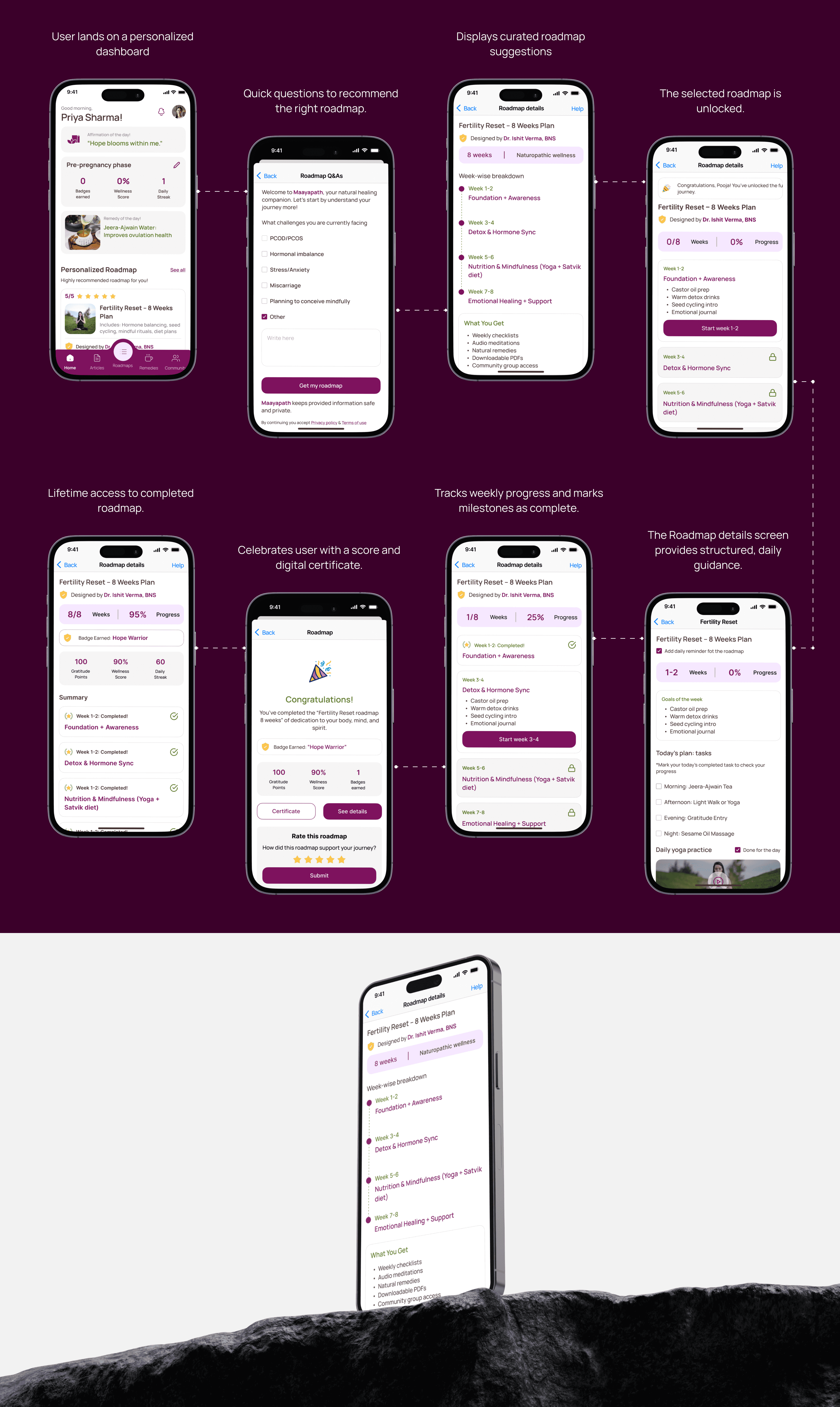
Maayapath’s app flow maps the user journey from onboarding to personalized wellness features, ensuring smooth, supportive navigation through every stage of motherhood.
Important Screens
Profile Space, My Activities, and Settings together offer a personalized, organized, and seamless space to track progress, access support, and manage the Maayapath experience.

Impact & Results
Delivered developer-ready specs via Figma
Ensured feasibility with engineering constraints
Maintained consistency across implementation