Building a scalable design language that accelerated product development, improved consistency, and prepared the platform for AI-driven experiences.
Live Project - Enterprise
Overview
Company: Schoolnet India Limited (Enterprise-SaaS)
My Role: Senior UI/UX Designer
Team: Design Lead • Project Manager • Full Stack Developers • QA • CTO
Duration: 2026 | 2 days
Tools: Figma, Figma Make, ChatGPT, Claude
Scope: Research • Design Tokens • Components • Documentation • AI-ready System • Developer Handoff
Building an AI-Ready Enterprise Design System
As the product grew, inconsistent UI patterns and duplicated components slowed both design and development.
I created a scalable design system that unified the product experience, improved collaboration, and established a foundation for AI-assisted product design.
I used Figma and Claude to explore, refine, and systemize the design foundations, enabling a faster and more thoughtful design system workflows
My Role
I was responsible for designing and building the enterprise design system from the ground up, ensuring it was scalable, developer-friendly, and ready for long-term product growth.
My responsibilities included:
Conducting UI audits and identifying inconsistencies across products
Defining design foundations including colors, typography, spacing, and grids
Creating reusable components and scalable variants
Building semantic design tokens with Light and Dark themes
Preparing production-ready documentation and HTML references for the Frontend team
Using AI tools such as Claude and ChatGPT to accelerate exploration, documentation, and workflow efficiency while maintaining design quality and consistency
The Challenge
Multiple UI inconsistencies across modules
Duplicate components and patterns
Slower design-to-development workflow
No centralized design standards
Needed to support future growth
My Approach
✅ Audited the existing product
✅ Defined design foundations
✅ Built reusable components
✅ Introduced semantic design tokens
✅ Created Light & Dark themes
✅ Documented the system for developers

Constraints
Building a design system within an active enterprise product introduced several practical challenges.
Multiple existing modules with inconsistent UI patterns
Continuous feature development alongside system creation
Alignment across Design, Product, and Engineering teams
Requirement for future scalability and theming
Maintaining backward compatibility with existing interfaces
These constraints required balancing immediate business needs with long-term system architecture.
Key Decisions
Standardized UI components
Created reusable components (buttons, forms, cards, tables)
Ensured consistency across admin and user modules
Introduced design tokens and theming
Defined colors, typography, spacing, and grid systems
Enabled light and dark theme support
Built a single source of truth
Centralized components and guidelines in Figma
Reduced ambiguity in design and development decisions
Focused on real workflow patterns
Designed components based on actual product use cases
Ensured system supported real user interactions, not just visuals
Improved design–dev collaboration
Aligned components with development feasibility
Reduced back-and-forth and implementation gaps
Admin Version Placement Module

Design Foundations
Created a scalable foundation using:
Color Tokens
Typography
Spacing
Grid System
Elevation
Border Radius
Icons
Designed for consistency, accessibility, and easy maintenance.
Component Library
Built reusable enterprise components including:
Buttons
Inputs
Tables
Cards
Navigation
Forms
Modals
Empty States
Data Components
Each component includes variants, interaction states, and developer-ready specifications.
AI-Assisted Workflow
Used Claude and ChatGPT to accelerate:
Documentation
Component exploration
Naming conventions
Design consistency
Workflow automation
AI enhanced the process it never replaced design thinking.
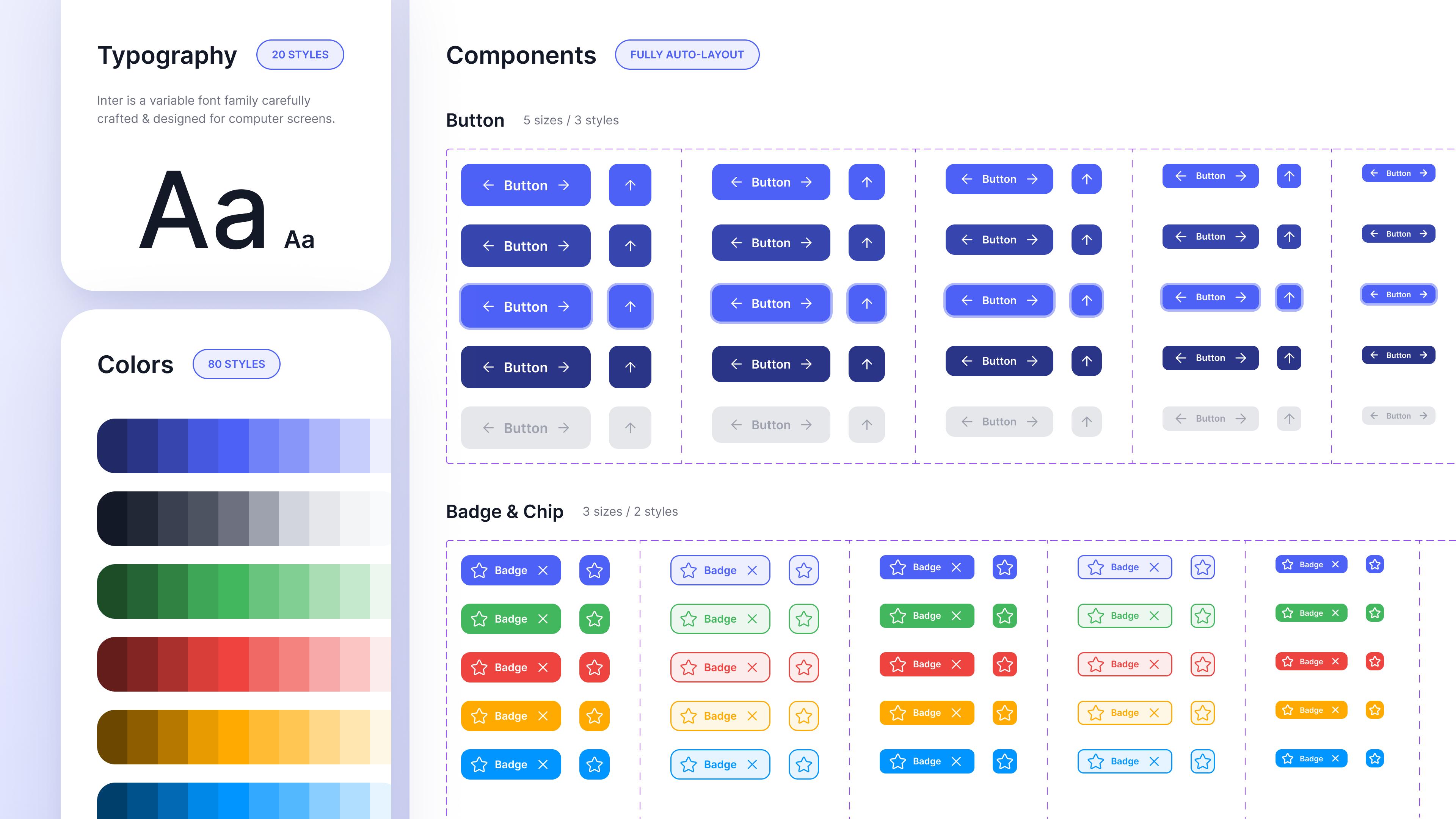
Defining colors tokens and text styles
Defined scalable color tokens and text styles to ensure visual consistency and accessibility across the product.
Established a centralized system that enabled faster design decisions and seamless design-to-development alignment.

Light & Dark Themes
Created separate Figma modes for Light and Dark themes to support scalable theming across the platform. This helped organize color tokens efficiently and ensured a consistent UI experience in different visual environments.

Color Variables Creation

Design Tokens - Dev-Hand Off


Accessibility Checks

Creating components
Built a comprehensive component library for the Placement Management Platform
Ensured consistency, reusability, and faster design execution across modules
Structured scalable components with well-defined states and variants
Maintained the system for easy updates and cross-team usage
Designed to support current needs while enabling future product expansion

Defining text styles
We optimized our text styles for a calmer appearance by decreasing font weight and size, and increasing line height. For the naming convention, we stuck closely to Tailwind CSS, which is used for the implementation.

Setting up components
In this initial iteration, our goal was to establish minimalistic and adaptable components capable of accommodating all our current use cases, with the intention of expanding them as necessary over time.
Design Impact
↓ 50% Reduction in design iteration time
↑ 2.5x Faster component creation using AI-assisted workflows
↑ 40% Improvement in design consistency across products
↓ 60% Reduction in redundant UI patterns
↑ 35% Faster developer handoff with structured components & tokens
↑ 30% Increase in design system adoption across teams
Built a scalable manual + AI-powered design system enabling faster, consistent, and intelligent product design
Product Impact
Established a unified design system combining manual components with AI-assisted generation
Standardized UI patterns across products, reducing design inconsistencies
Enabled faster design-to-development workflows with reusable, scalable components
Business Impact
Reduced design and development turnaround time for new features
Improved cross-team collaboration between design, product, and engineering
Created a scalable foundation for AI-driven product experiences
Key Learnings
Great products scale through systems not screens.
Build foundations before components
Prioritize consistency over customization
Design with developers, not just for them
Use AI to accelerate execution, not decisions
**NDA & Copyright**
This case study is shared for portfolio presentation only.
Due to NDA, internal data and sensitive details are not disclosed.
All rights and ownership belong to Schoolnet India Limited.
***This work cannot be reused for personal or commercial purposes.***